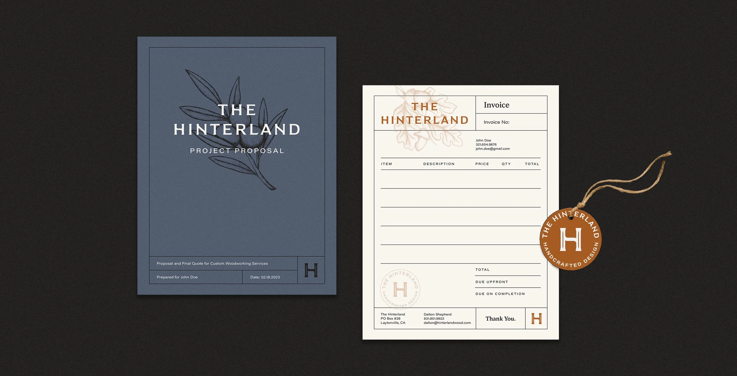
The Hinterland
Brand Identity
The Hinterland sought to honor the rich heritage of their craft while also embracing a contemporary aesthetic in their visual identity. Although the brand's foundation is rooted in classic woodworking techniques, their furniture often explores the cutting edge of modern design.
“The Hinterland” means “the land behind,” which often refers to uncharted areas beyond city centers and coastal regions. With their woodworking shop nestled deep in the forest in Mendocino County, this name was the ideal choice—symbolizing both the origin of their materials and the essence of their brand.
Year
2023
Client
The Hinterland
Services: Naming, Logo/Identity Design, Illustration, Print Collateral, Social Media, Photo Retouching, Brand Guidelines
The wedge serifs in the logotype are reminiscent of dovetail joinery, while muted color palette brings a rustic and confident feel to the brand.


