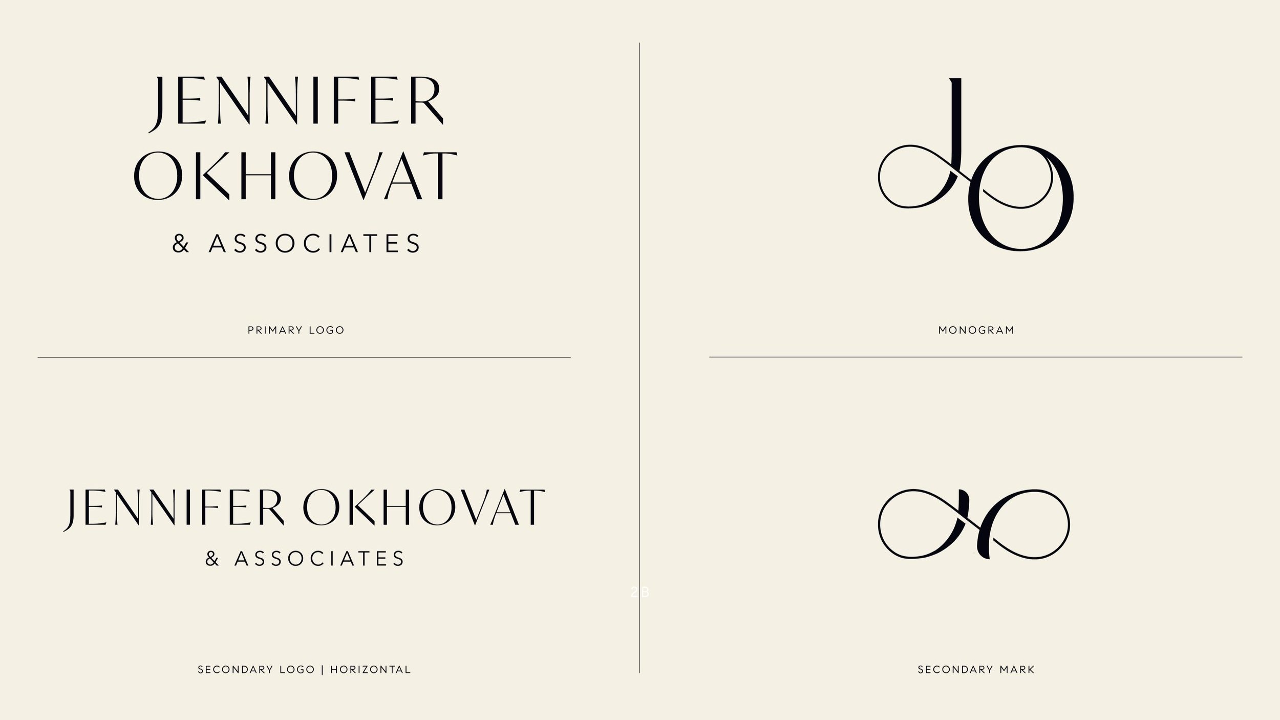
Jennifer Okhovat
Logo and Marketing Collateral
As a top-selling Beverly Hills agent, Jennifer Okhovat requested a visual identity to elevate her collateral and set her team apart from other high-end real estate agents. She wanted to incorporate blue tones and showcase a sense of elegance combined with whimsy.
Our team got to work and presented three different visual systems to the client. Leading two of these directions, I showcased one identity to be more minimalist and elegant in its approach, while in the other, I explored a more playful and colorful system. In both of the directions, I included a custom logo, a color palette, social media, and print collateral.
Year
2022
Client
Jennifer Okhovat
Team
In–House: Compass Design Studio
Senior Designer: Lauren Thawley
Designers: Kendra Oliver, Juliet Desnoyer
Direction 1
Elegant | Simple | Muted
Direction 2
Curvy | Colorful | Playful


